Example tutorial notebook#
Learning Objectives
This is an example tutorial notebook for UW hackweeks
understand basic Jupyter Book formatting of .ipynb files
use an open source Python library ipyleaflet to create interactive maps
☝️ This formatting is a Jupyter Book admonition, that uses a custom version of Markdown called MyST
Computing environment#
We’ll be using the following open source Python libraries in this notebook:
import ipyleaflet
from ipyleaflet import Map, Rectangle, basemaps, basemap_to_tiles, TileLayer, SplitMapControl, Polygon

import ipywidgets
import datetime
import re
Data#
We will examine raster images from the MODIS instrument. “MODIS” stands for “MODerate Resolution SpectroRadiometer”. Moderate resolution refers to the fact that MODIS data has at best a 250 meter pixel posting, but single images cover hundreds of kilometers, enabling daily views of the entire globe:
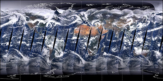
Fig. 1 Mosaic MODIS image from the first complete day of coverage, June 30, 2000#
☝️ This formatting is a Jupyter Book markdown figure
Note there are two identical MODIS instruments on separate satellites
Satellite |
Launch date |
|---|---|
Terra |
December 18, 1999 |
Aqua |
May 4, 2002 |
Interactive visualization#
The ipyleaflet library allows us to create interactive map visualizations. Below we define a geographic bounding box for our area of interest, and plot it on an interactive “slippy map”.
bbox = [-108.3, 39.2, -107.8, 38.8]
west, north, east, south = bbox
bbox_ctr = [0.5*(north+south), 0.5*(west+east)]
Display the bounding box on an interactive basemap for context. All the available basemaps can be found in the ipyleaflet documentation
m = Map(center=bbox_ctr, zoom=10)
rectangle = Rectangle(bounds=((south, west), (north, east))) #SW and NE corners of the rectangle (lat, lon)
m.add_layer(rectangle)
m
NASA GIBS basemap#
NASA’s Global Imagery Browse Services (GIBS) is a great Web Map Tile Service (WMTS) to visualize NASA data as pre-rendered tiled raster images. The NASA Worldview web application is a way to explore all GIBS datasets. We can also use ipyleaflet to explore GIBS datasets, like MODIS truecolor images, within a Jupyter Notebook. Use the slider in the image below to reveal the image from 2019-04-25:
m = Map(center=bbox_ctr, zoom=6)

right_layer = basemap_to_tiles(basemaps.NASAGIBS.ModisTerraTrueColorCR, "2019-04-25")
left_layer = TileLayer()
control = SplitMapControl(left_layer=left_layer, right_layer=right_layer)
m.add_control(control)

m.add_layer(rectangle)

m
Exercise 1#
Re-create the map above using different tile layers for both the right and left columns. Label a single point of interest with a marker, such as the city of Grand Junction, Colorado.
# Add your solution for exercise 1 here!
Summary#
🎉 Congratulations! You’ve completely this tutorial and have seen how we can add notebook can be formatted, and how to create interactive map visualization with ipyleaflet.
Note
You may have noticed Jupyter Book adds some extra formatting features that do not necessarily render as you might expect when executing a noteook in Jupyter Lab. This “admonition” note is one such example.
Warning
Jupyter Book is very particular about Markdown header ordering to automatically create table of contents on the website. In this tutorial we are careful to use a single main header (#) and sequential subheaders (#, ##, ###, etc.)
References#
To further explore the topics of this tutorial see the following detailed documentation: